 +1 855 796 4355
Power BI new Visual : Ribbon Chart
Introduction:
In this blog article, we will explain about the new Visual of Power BI: Ribbon chart!
Ribbon Chart:
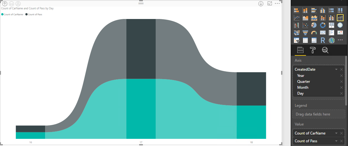
The visual is like a stacked column chart, but each column’s inner categories are sorted according to their rank for that column. Additionally, the inner categories are connected by ribbons across the columns.
Refer below Screen Captured:
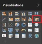
You’ll find this new chart option to the right of the combo chart.
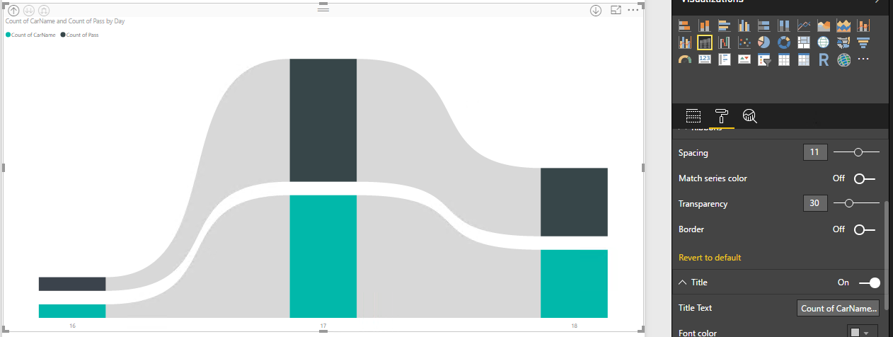
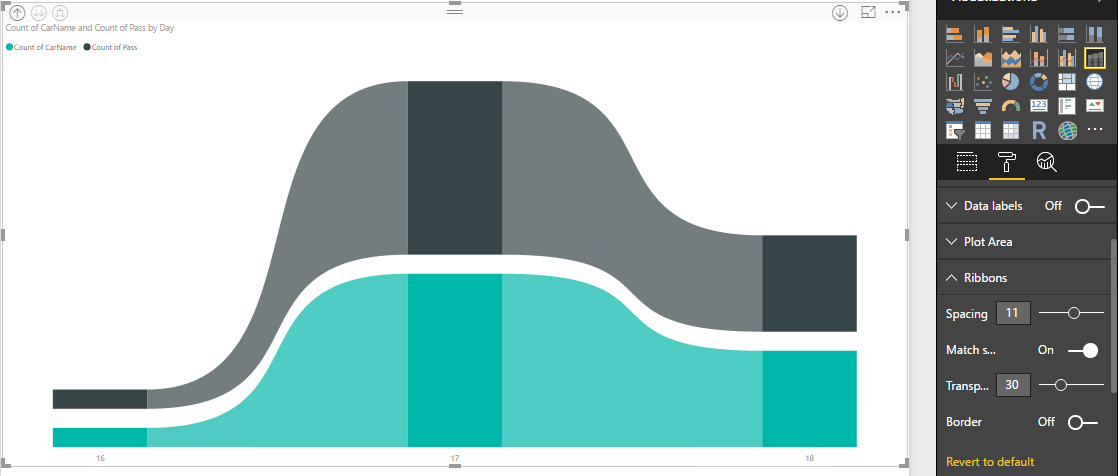
The chart’s field well and formatting options are the same as a stacked column chart with some extra formatting options for the ribbons. There’s a Ribbon card in the formatting pane that lets you control the ribbon style:
- Spacing between ribbons – You can use this option to set a gap width between the ribbons. By default, there is no spacing.
- Match series color for ribbons – By default, the colour of the ribbons is to match the category’s color, but you can turn this off and the ribbons will be grey in color.
- Transparency for ribbons – You can control the transparency of the ribbon’s color. By default, it is set to 30.
- Border for ribbons – By default, the ribbons don’t have a border, but you can turn borders on.
![]()